Still life animated webpage
Project brief
Provided summary - find a household item and create a single page site (different from the original, not ecommerce) that sells only that individual item. All content, text and images was to be unique and motion design included if possible.
University module project - January 2021
Website design / development
Link to open site
Research & planning
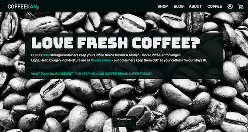
Firstly research was undertaken into single page websites of this nature. Research was also conducted into motion or animated design as this was to be included and not used before. Furthermore research was conducted into the content to be included based on the household item chosen - a storage cannister for coffee beans.
From the conducted research the following plans were drawn:
- Use of Greensock JavaScript animation library for scroll based animation
- Images to include: coffee beans, coffee cannister and individual components
- Textual information including cannister purpose and specification
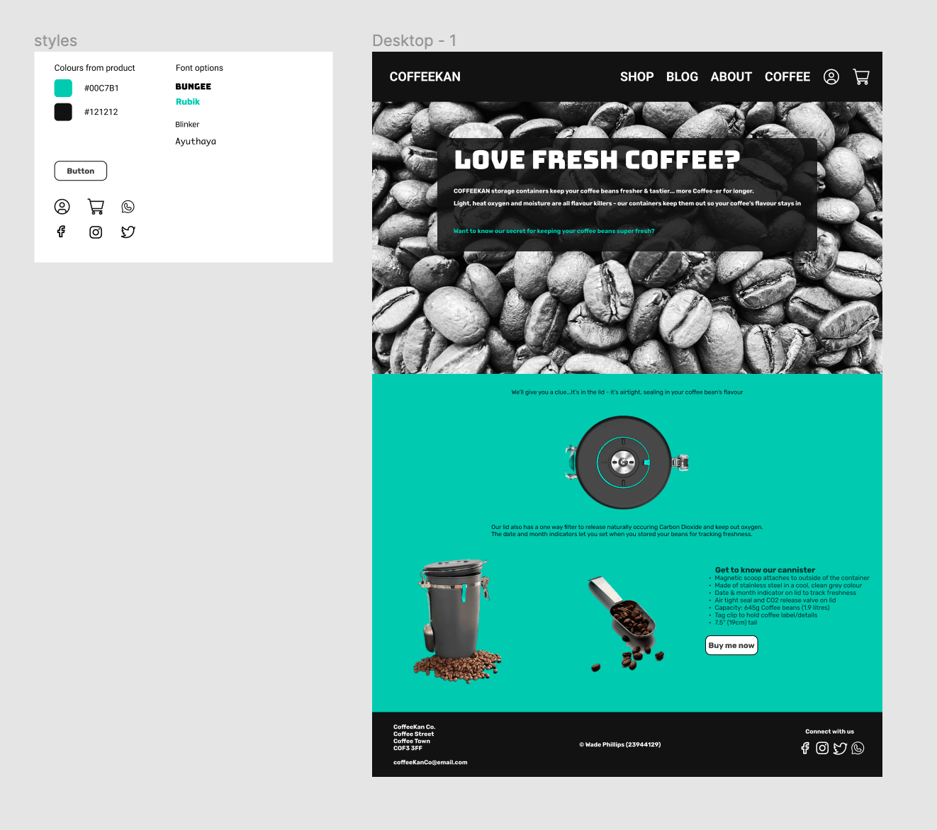
- Colour palette to be used based on product colours.
Bespoke photography was used for the site, images were all taken on a iphone 12 pro and optimised for web use.
Design
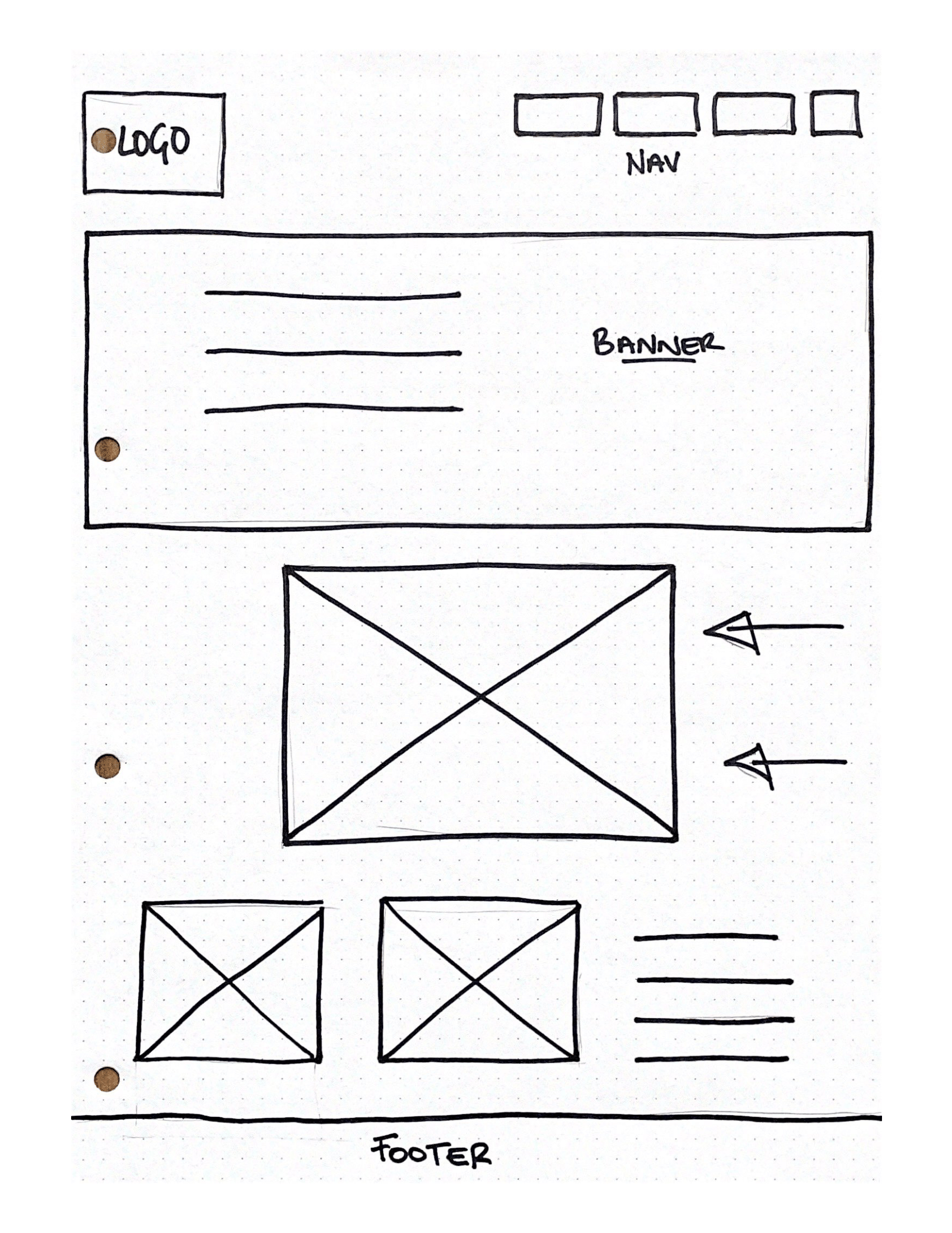
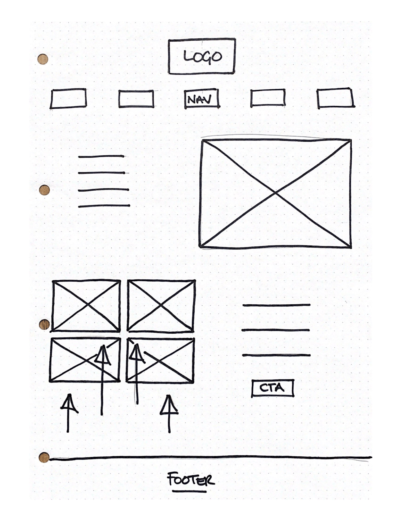
To start the design was mocked up on paper sketches, iterations of concepts were drawn up, considerations at this point included:
- Design structure - a single page site but navigation options real to life were included
- Animations - how animation could be used for emphasis of important information
- Mapping the animations so they work as intended, portray the information required and flow on the screen


A basic design system was implememted in Figma. Colours, fonts and icons were considered and laid out. At this point now it was conceptualised how to use the photographs taken. The backgrounds were removed, filters and editing was undertaken via online tools.

Originally the Greensock JavaScript library was going to be utilised to animate the images onto the page from the side. However, to draw attention to the components of the lid and to experiment with the scrolltrigger function within Greensock, an image of the lid was deconstructed into seperate parts. The seperate parts were then animated into position on scroll to highlight the importance of the cannisters lid features.
Build
The final site was built using semantic HTML5 and CSS. The CSS was implemented via Sass, a CSS extension langauge that allowed cleaner code and the use of such features as colour and font variables and nesting within the code. Responsive design consideration allowed the design to scale up and down as required. Features such as CSS grid and CSS animation were incorporated into the design.
The Greensock library supports minimal JavaScript to be used to achieve the desired result. The final design allowed for the lid parts to animate into place as the user scrolls down the page. This was achieved by setting a section on the page as a trigger and the location it needs to hit to start the animation upon scroll. A point was set to the finish the animation and scrubbing applied to smooth the effect.
Version control was utilised for project entirety, with regular commits to a BitBucket repository using Git.
Testing
Before deployment automated testing was undertaken, as well as the continuous manual functional testing that had been undertaken throughout the iterative developement phase. The site was tested in a manner of ways to ensure adequate performance and accessability. Google lighthouse was used to test the site, with performance, SEO, accessability and best practices scores all returning 90+ out of 100. The WAVE web accessability tool was also run and returned no errors or alerts.
Cross browser testing was undertaken to ensure the site functioned correctly across all browsers and returned no issues.
All HTML and CSS was run through the W3C code validators to ensure they met current standards and best practices.
Finally the site was hosted via Netlify and tested again to ensure all features still worked. The site was deployed directly from BitBucket so that it automatically deployed and updated as changes were commited and pushed to the repository.