MDS Global Agentview
Project brief
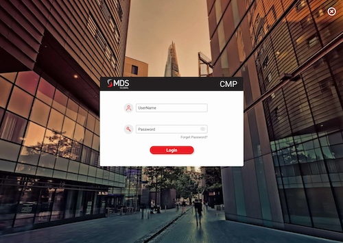
Your challenge will be to design a completely new look and feel for the AgentView screens in line with the MDS Global corporate branding guidelines. As well as the visual element, this new design should focus on the agent’s experience to present customer details in a simple and intuitive way and minimise the time taken to address customer enquiries and complaints.
University module project - January 2021
Figma prototype
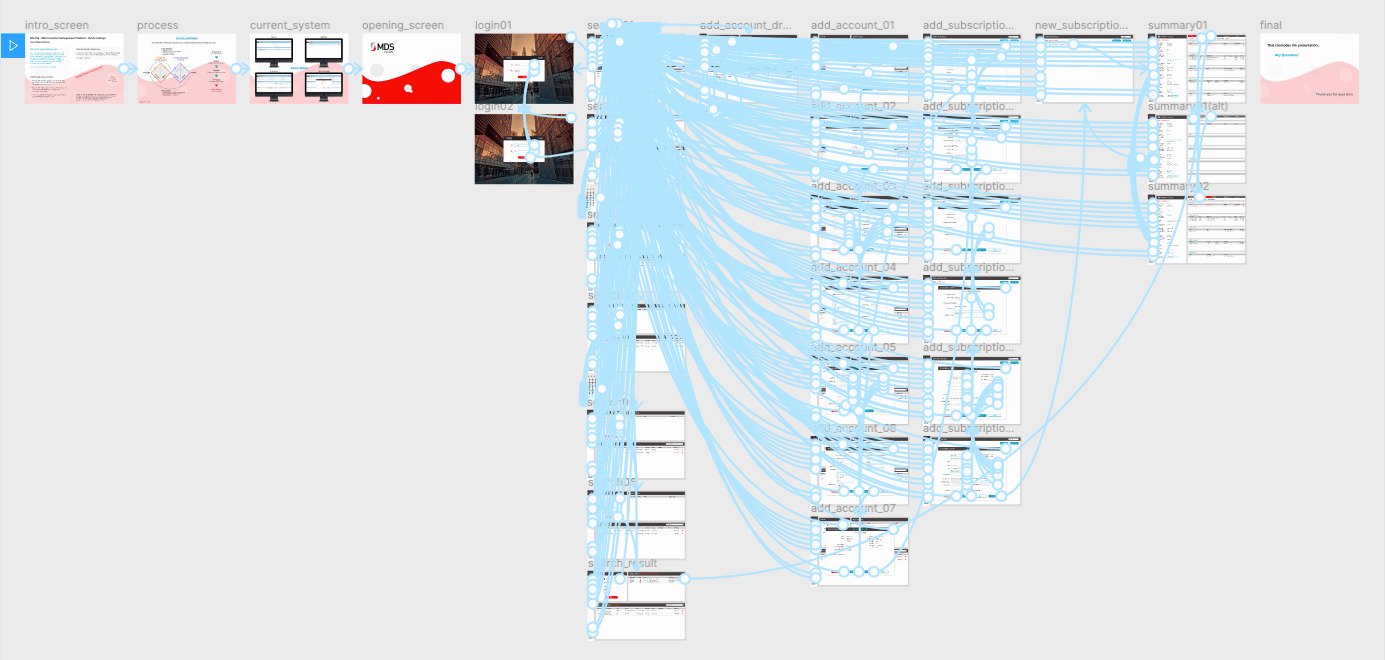
Link to interactive Figma prototype
Current system
The stakeholders stated the current system UI has existed since the software was developed (20+ years). They felt it was dated and due modernisation. The main complaints raised were; there's too much unintentional white space and the specified agent user journey has too many unnessecary steps. The main information needed was pulled from the current system to be inluded in the re-design.

Empathise
No access to the real users (call center agents) of this current system could be obtained due to global pandemic situation.
Online stakeholder interviews were conducted and the company provided:
- Project brief
- Video of current system
- Current company style guide
- Clips of other company resources - apps etc
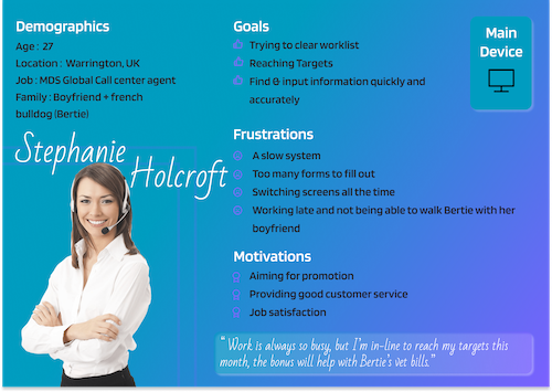
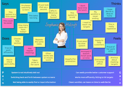
Based on the information provided and gathered, informed user personas and user mapping was created to get in the head space of the call center agents and how they use the system for the specific user journey.


Define
The main aim of the definition stage was to encapsulate the problem the company were trying to address.
From the provided brief and stakeholder interviews the task was split into the following aspects:
- The current user interface (UI) is dated - consider and develop a modern redesign of the MDS global AgentView UI in line with current company branding and resources -> create a modern and intuitive UI
- The user experience (UX) around installing a new subscriber on the system is too cumbersome - consider and improve the UX around a typical agent user journey of ‘installing a new subscriber’ to the system -> reduce the clicks and workflow to complete task
- Create a functioning prototype in Figma, presentable to client detailing process undertaken
Ideation
The ideation phase began with some desk research, the following areas were researched to inform potential solutions:
- The current AgentView system, notes were made on what aspects were to be kept, removed and which could be combined. The screens required for the prototype were broken down and documented
- The companies current assets, including website and mobile application were studied for styles, themes and approach. During the interviews it was stated the design should be in-line with the companies current branding
- Online research was undertaken in modern dashboard design. All aspects were studied to gather suitable inspiration for the solution design system.
Now that content, style and approach had been considered, paper wireframes were sketched up with numerous possible layouts for the pages to be focused on

The main design challenges at this stage were:
- Redesign the UI look - reduce whitespace, modernise appearance
- Combination of the search page and agent work list
- Alternative layout for the account summary page
- Minimise the 'add a subscriber' form process by reducing the number of forms
The forms for adding a subscriber were studied, information grouped appropriately, considering Gestalt principles for proximity and 12 forms were reduced to 7.
Iterations of designs were drawn out, and progressed through to concepts that could be firmed up and started in Figma.
Prototype
At this stage, the first step was to put together a basic design system, which contained the following elements:
- Primary and seconday colour palettes - pulled from current resources and company style guide
- Light and dark company logos
- Main components to be used within the design: buttons, form fields and selectors
- An icon set based on the features and icons used in the current system

From there firmed out digital wireframes were produced before moving onto the high fidelity interactive protoype.
The following pages were the focus of the project prototype:
- Search and worklist combination page - previously 2 seperate elements
- Add a new subscription - forms to be filled out by call centre agent
- Summary page - showing all of the information of the account
Once the main pages were complete, additional screens could be added for the interactions. The prototype was made to be as interactive as possible, while minimal exposure to the current system meant not all aspects were developed, the sections around the main pages were constructed as detailed as the project nature allowed.

Overlays were utilised in Figma to allow hover states on the prototype and form filling was also visualised for a realistic presentation to the stakeholders.
All frames, groups, components and elements were named and laid out in a manner suitable that should the prototype be handed off or passed to a team that no difficulty would be had in understanding the build.

Testing
Continuous and iterative testing was undertaken by myself throughout development of the Figma prototype. Due to the size of the current system, only a small portion had been included in the prototype based around the issues discussed by the stakeholders. Interactivity was included where posisble to demonstrate the working of the prototype.
The final project deliverable was the interactive Figma prototype, this was presented along with methods undertaken to the stakeholders via Microsoft Teams for their thoughts and feedback.
Written content was spelling and grammar checked, images were optimised where suitable and all interactions checked.